A design system with Figma and React
1/10/2024 - 5 min. de lecture
When designing a design system or UI kit, the transfer of information between designers and developers is an essential step. A concrete example here of a transition from Figma to React.
Construction
The main advantage of Figma is component properties. Let’s use them.
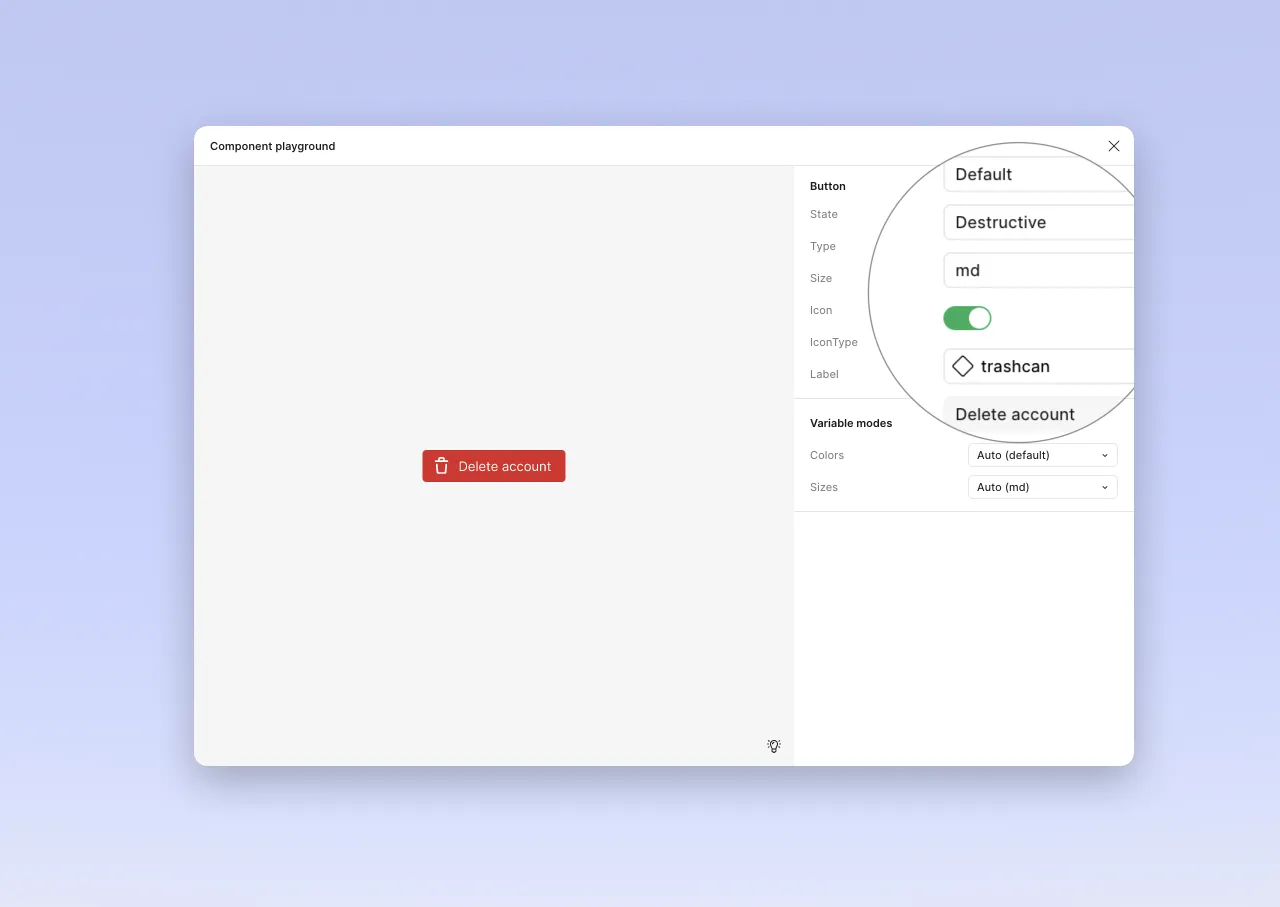
The component structure therefore looks like this.
// Button component in Figma
Button : {
	State : ["Default", "Hover", "Disabled"],
	Type : ["Primary", "Secondary", "Destructive",
    "Outlined", "Ghost", "Link"],
	Size: ["sm", "md", "lg"],
	Icon: Boolean,
	IconType: Component,
	Label: String
}
When “translating” to React, we can reuse most of the properties. However, it’s not a direct copy. Conditional display in Figma is limited to a boolean (properties with true | false). Here is the structure adapted to React (and HTML).
// Button component in React
Button : {
	State : ["Default", "Hover", "Disabled"], // Defined by HTML, targeted with CSS
	Type : ["Primary", "Secondary", "Destructive", "Outlined", "Ghost", "Link"], // CVA
	Size: ["sm", "md", "lg"], // CVA
	IconType: Component, // Reference to another component, if absent, no icon
	Label: String // Passed as argument to component: same as for icon, its presence can condition display
}The component is initialized with a few props, and CVA is used to manage states.
export type ButtonProps = React.HTMLAttributes<HTMLButtonElement> & VariantProps<typeof buttonVariants> & {
    label: string;
    Icon?: React.ComponentType<IconProps>;
}
const buttonVariants = cva("button transition ...", {
    variants: {
        type: {
            primary: [
                "bg-button-bg-color-filled",
                "text-button-text-color-filled",
                ...
            ],
            secondary: [
                "bg-none",
                "text-button-text-color-outline",
                "border-button-border-color-outline",
                "border",
                "text-button-text-color-outline",
                ...
            ],
            destructive: [
                "bg-button-bg-color-destructive",
                "text-button-text-color-destructive",
               ...
            ],
            ghost: [
                ...
            ],
            ...
        },
        size: {
            sm: ["text-sm", "px-2", "gap-1", "h-6"],
            md: ["text-base", "px-3", "gap-2", "h-8"],
            lg: ["text-lg", "px-4", "gap-2", "h-10"],
        },
    },
});
The component is built, it can be called:
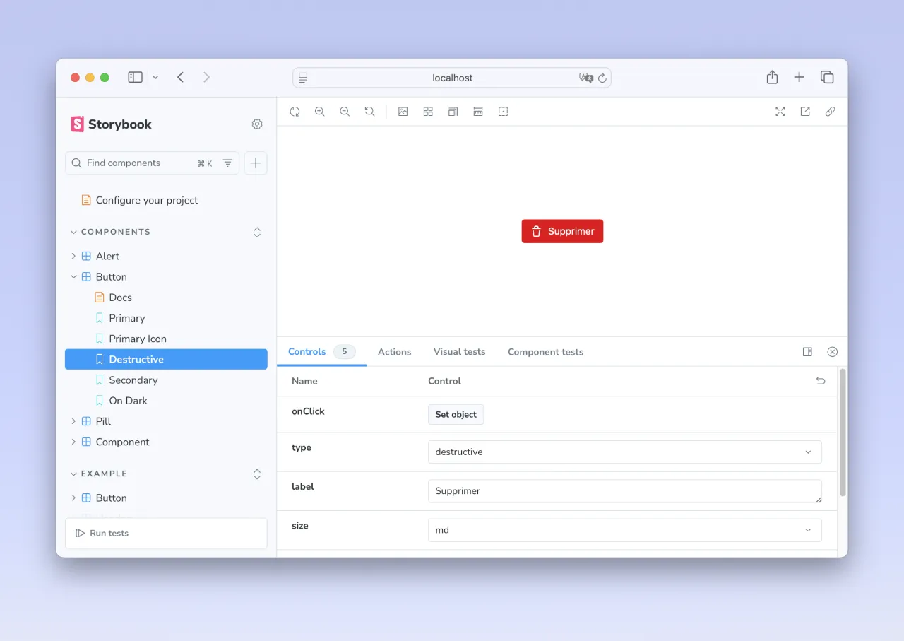
<Button label="Delete" type="destructive" Icon={Trash} size="md" />React offers the freedom to build the component as desired. We can therefore use children rather than attributes.
<Button type="destructive" size="md">
	<Trash size=16/>
	Delete
</Button>
I would favor the first solution. Parameters are exposed, integration doesn’t worry about visual structure: the icon is before the name, or the reverse. If the position must vary, we’ll expose a parameter. Something like iconPosition: after|before, for example. We thus separate responsibilities, and display decisions are managed inside the component. When calling, we only configure the component.
But to be honest, I’m not dogmatic. It’s a good example of Tesler’s law of conservative complexity. It will therefore be a matter of knowing where to place this complexity: in its call? In the heart of the component? Whatever way the front developer chooses to create and maintain them, we must agree on a way to transfer information. And document it (and that’s a big topic, which is not the subject of this article).
More complex: a list item
First, we need to define how we want the component to be called. An example (with default states).
<ListItem
Type="Text" // Default: Text
Label="Label" // Default: Label
Rounded={false} // Default: false
DetailsDisplay="NewLine" // Default: Newline
Size="md" // Default: md
Icon={Cog} // Default: Null
Checkbox={true} // Default: false
Pill="00" // Default: null
Favorite={false} // Default: false
Kbd="⇧ ⌘ K" // Default: null
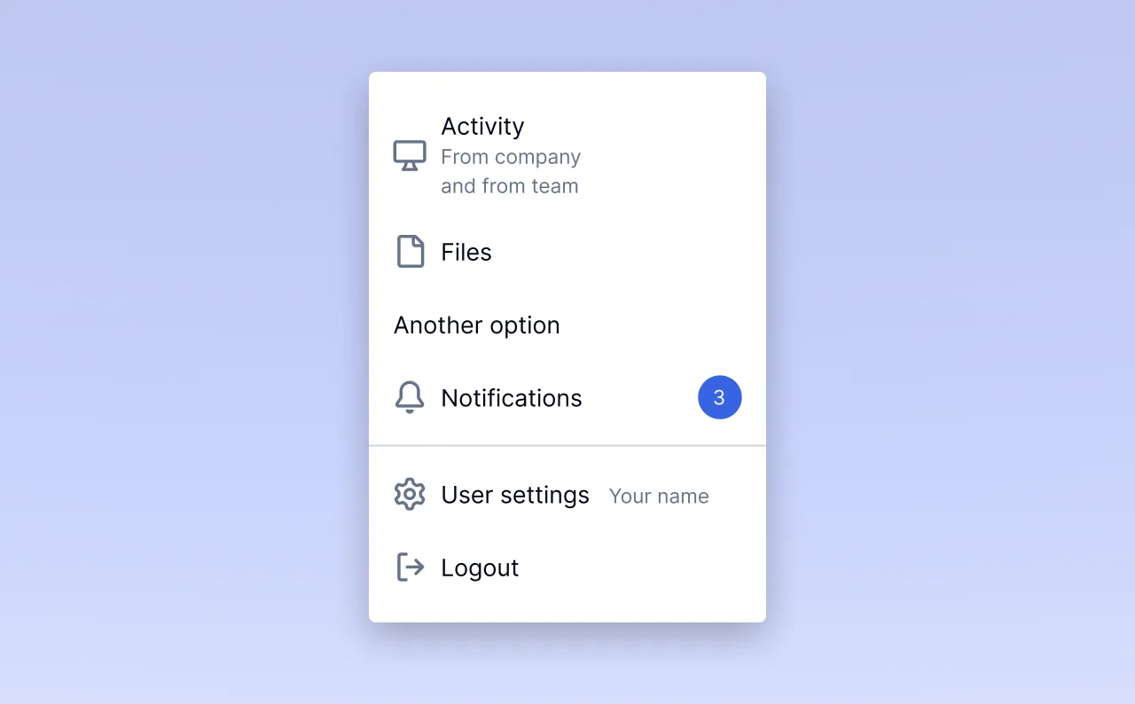
/>Which allows building a menu like this
<List>
	<ListItem DetailsDisplay="NewLine" Size="md" Icon={Screen} Icon={Archive} />
	<ListItem Label="Files" Icon={File} />
	<ListItem Label="Another option">
	<ListItem Label="Notifications" Icon={Bell} Pill="3" />
	<ListItem Type="Separator" />
	<ListItem Label="User settings" Icon={Cog} DetailsDisplay="InlineAfter" Details="Your name" />
	<ListItem Label="Logout" Icon={Logout} />
</List>
There are more design decisions to make here (in design and in code). With always the same observation: communication is key.
Conclusion
We can see that when building a design system, a translation effort is necessary to transfer components from the graphic software to code. This correspondence grid will be the subject of the greatest attention from developers and designers. Initiating this dialogue as early as possible allows defining shared modalities among all participants.
Because we know: even more than its construction, it’s the appropriation and maintenance of a design system that will be crucial, and that will determine its impact on the company’s products.