Rethinking the user experience at Assia
14/02/2025 - 5 min. de lecture
In 2024, I helped Assia review the user experience and interfaces of its management tool for mutual insurance companies. I arrived as a lead designer in a company with a long history, but which was discovering several new aspects. The waterfall model had been the standard until then, and agile development principles would be implemented with this project. Having an integrated designer was also new. External designers had worked in the past on certain peripheral components. This time, it was the core of what Assia sells that needed to be rethought. The task was challenging and exciting. Here’s how I approached it.
The system’s skeleton
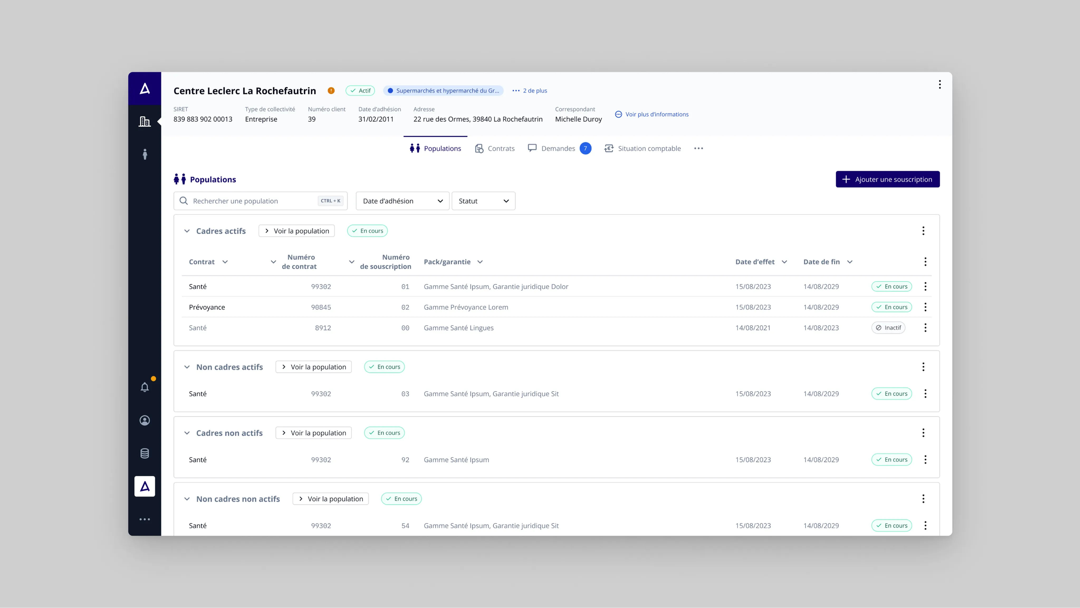
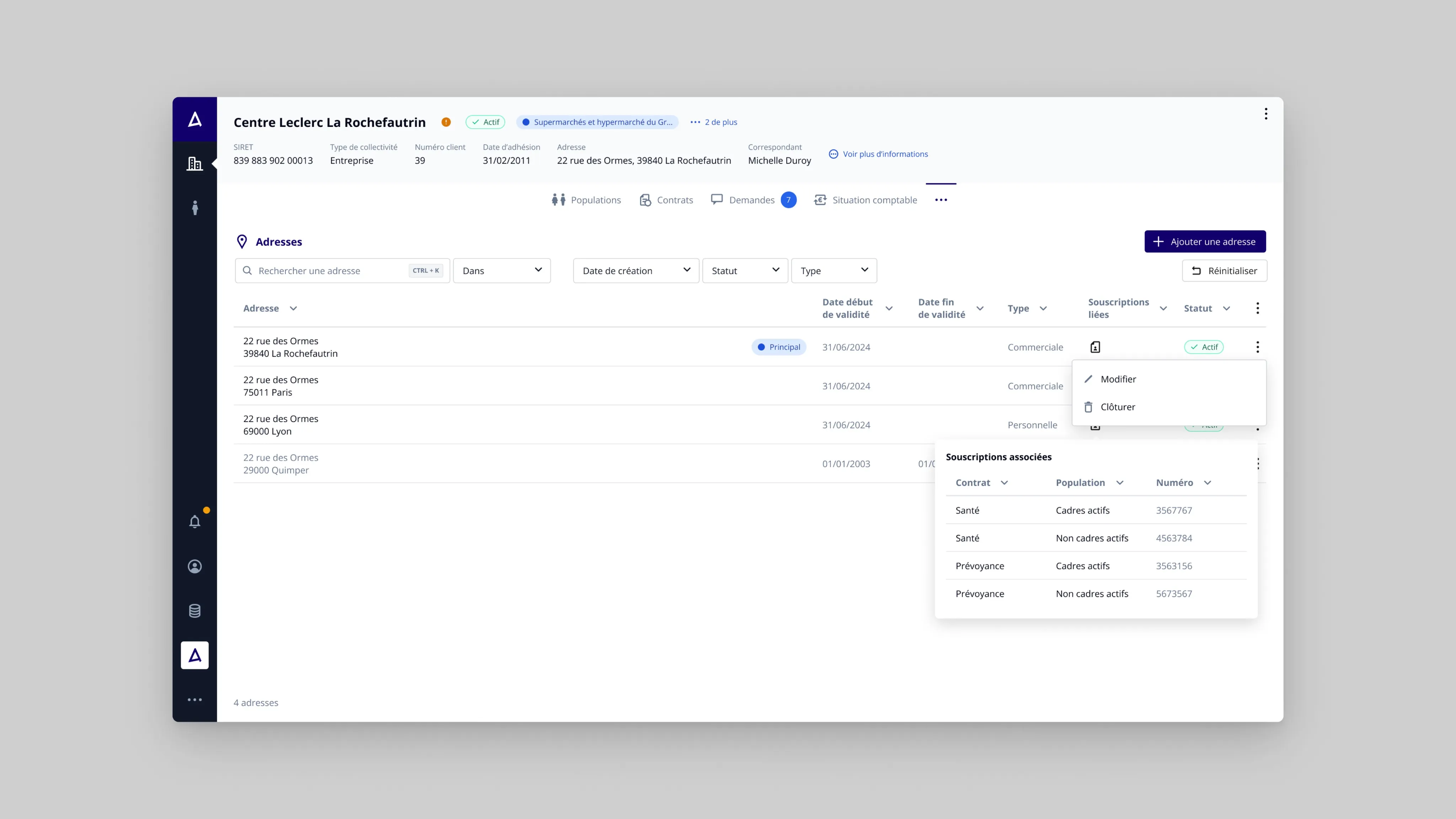
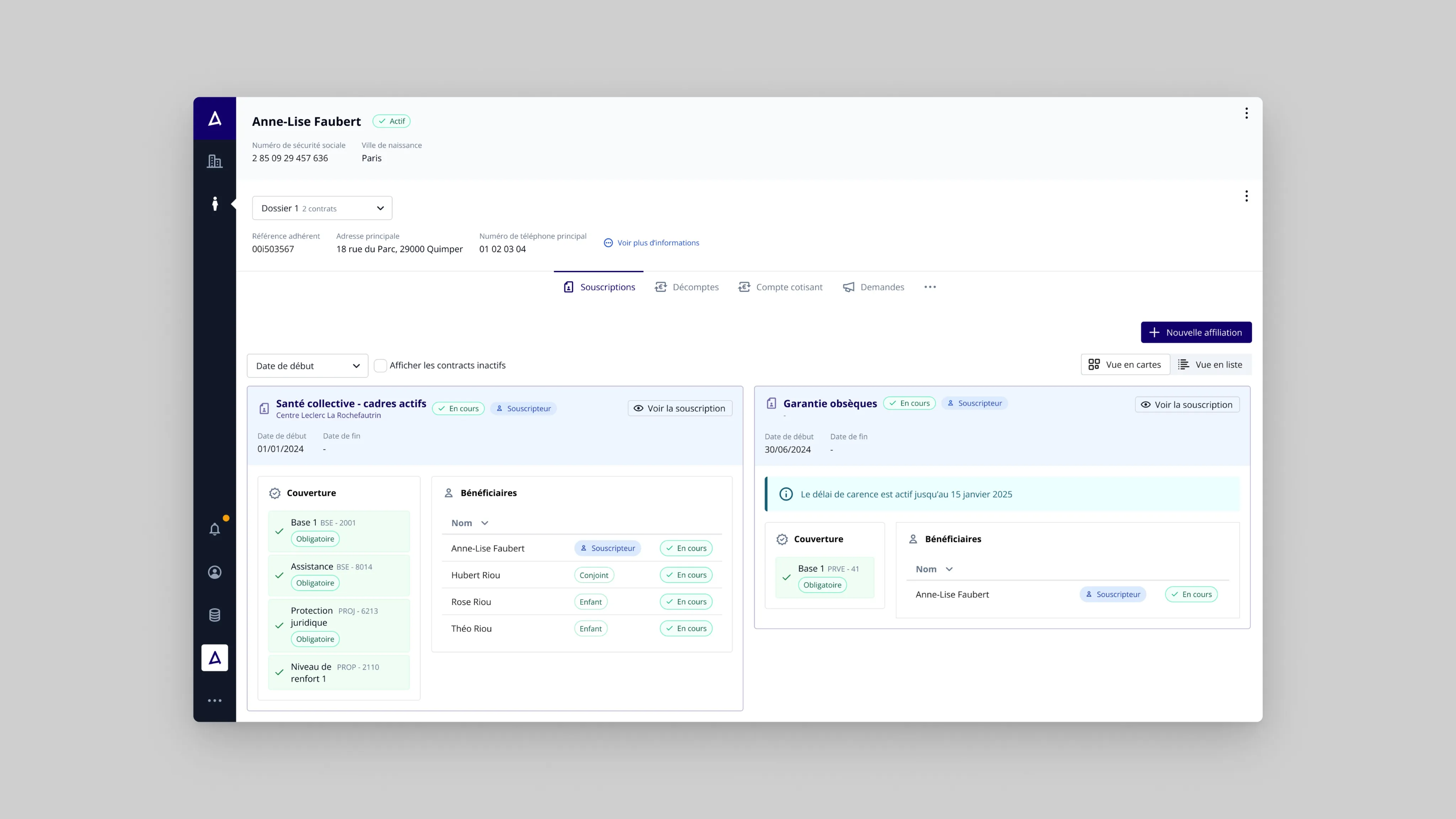
While reviewing tickets from users (primarily mutual insurance managers), I realized that their practice was caught in the network of constraints imposed by the software. This is a critical point: the learning curve for users is particularly steep. The problem is that this pain point is not inherent to the business, but is largely caused by the interface. We therefore need to remove this layer of complexity and make system manipulation as transparent as possible.
Interface complexity is superimposed on business complexity
This is often the problem with information systems that have a heavy legacy: a large number of people have intervened with their own logic, and the interface is the consequence of these successive layers of heterogeneous thinking. Some things are coherent and derived from the business, others are contortions whose authors, if they’re still available, have trouble tracing back.
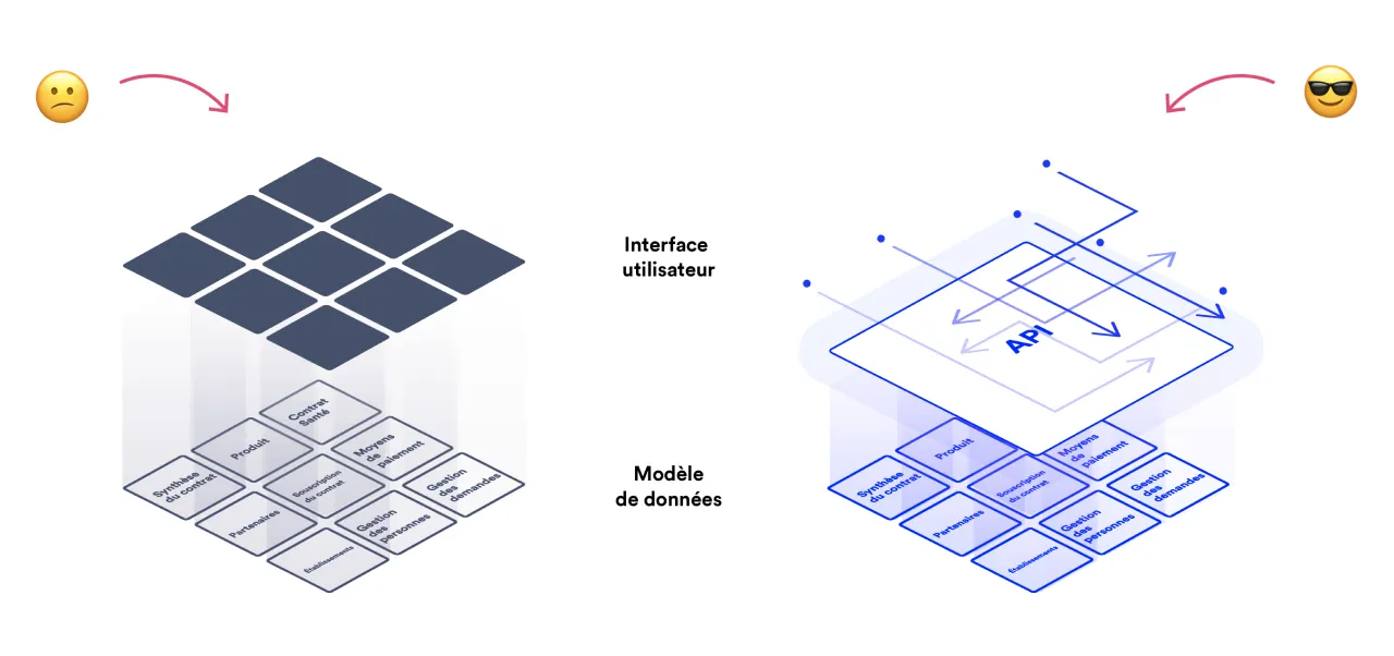
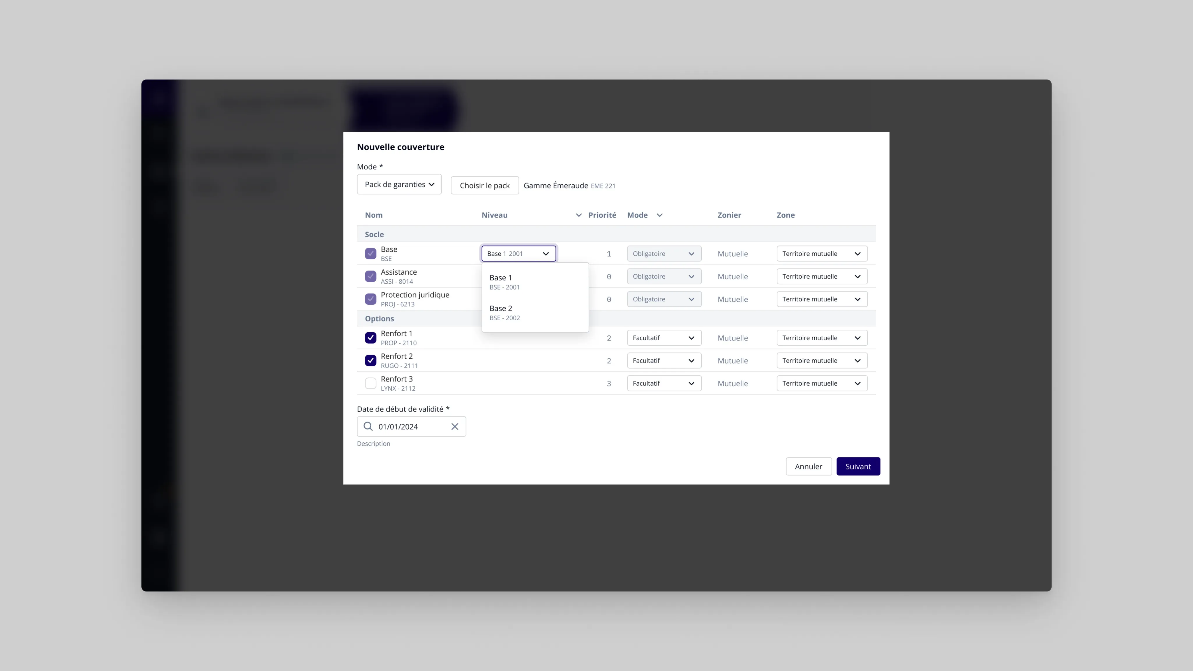
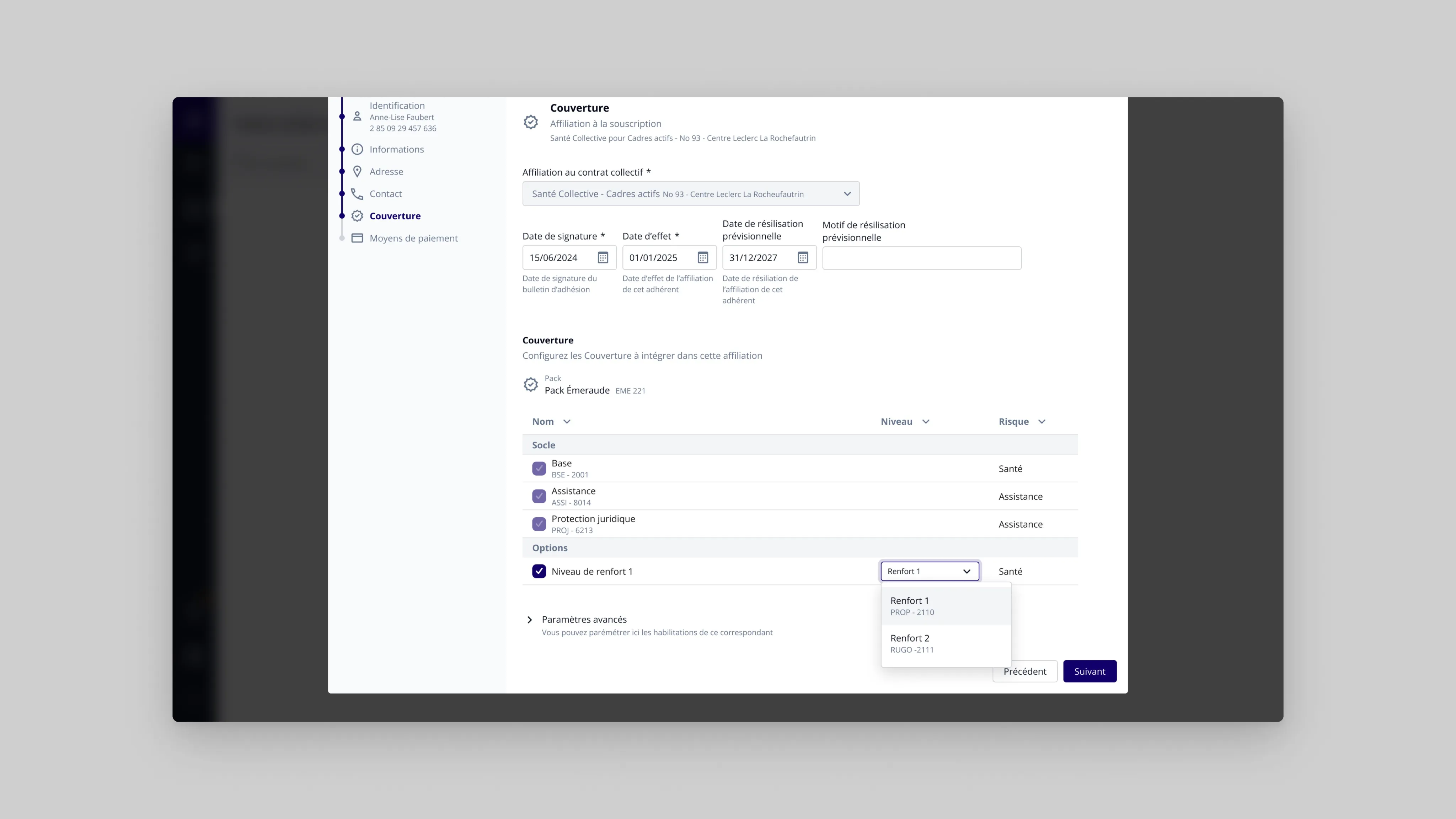
To distance this cumbersome legacy, the first task is to identify the system’s objects: currently buried among everything else, we need to find the main entry points, those that create value for the user. Those that mean something in their daily practice. This is the time for investigative work with users and with the ever-present technicians. The ORCA framework particularly helped me with this. The new product, on the surface, will be different. The data, however, will remain the same. The product will live in both worlds (not for too long, we hope, but nothing is less certain). A card sorting exercise then allows us to identify relevant navigation, based on the system’s skeleton.
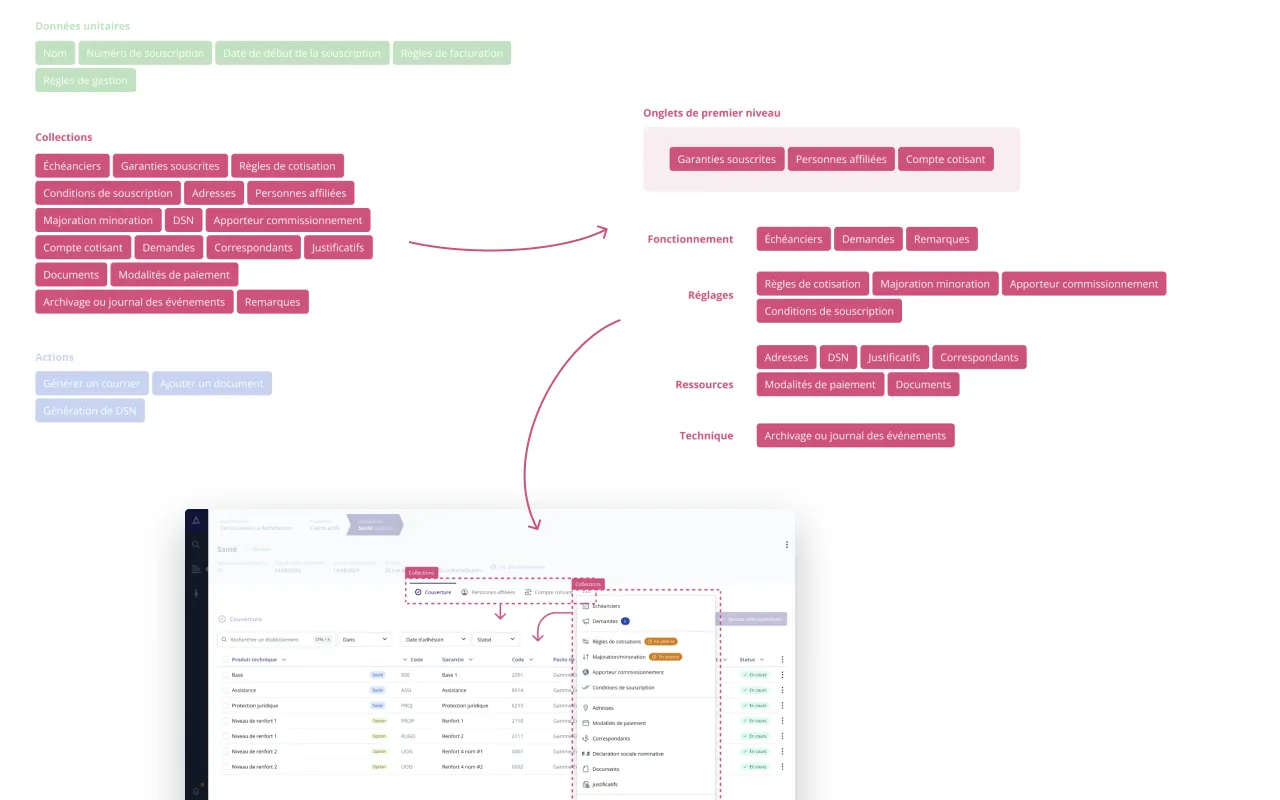
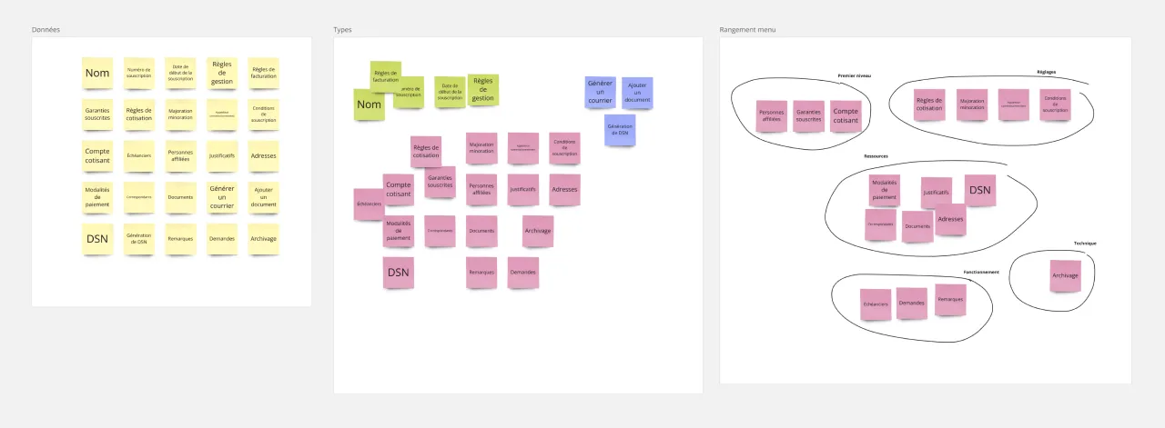
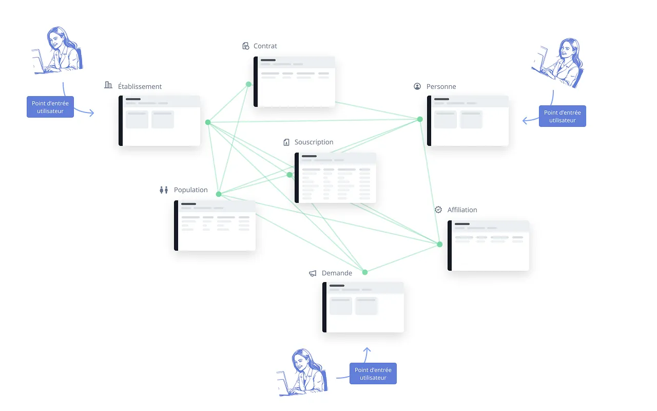
At this phase, the seeds of what will one day become the company’s central product are sown very early. We need to establish solid interface foundations that won’t be called into question in a few weeks or months. They must also withstand the test of time. For navigation, only very proven approaches. The card sorting work helped us see clearly. And for the internal structure of interface views, it’s the initial research phase that structures this work. The goal: to avoid major design changes later. Because course corrections will become increasingly costly.
Empowering the team
At this point, two tasks are carried out simultaneously: establishing the foundation for user journeys and disseminating design decisions.
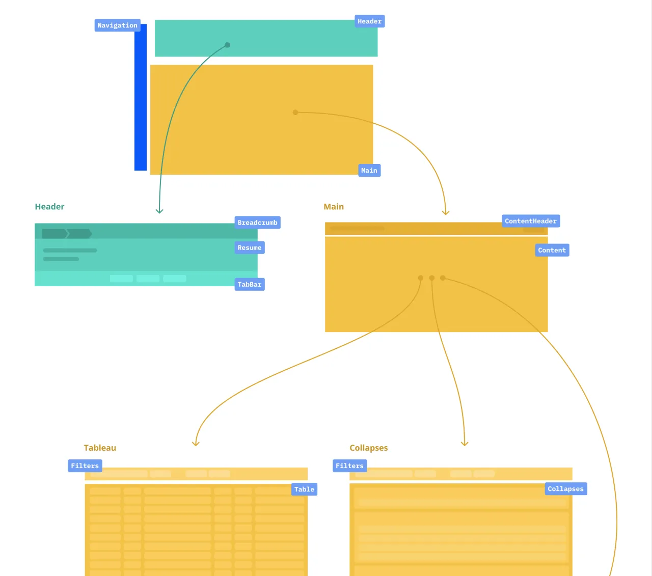
Graphic artifacts are produced (primarily Figma files), but they are only part of what serves developers and product owners to create the product. It is essential that the major principles become firmly anchored as development progresses. Developers want concrete solutions: good news, a design system is available.
By creating pathways in the documentation of design principles, design is then no longer solely the designer’s concern, but the entire team’s
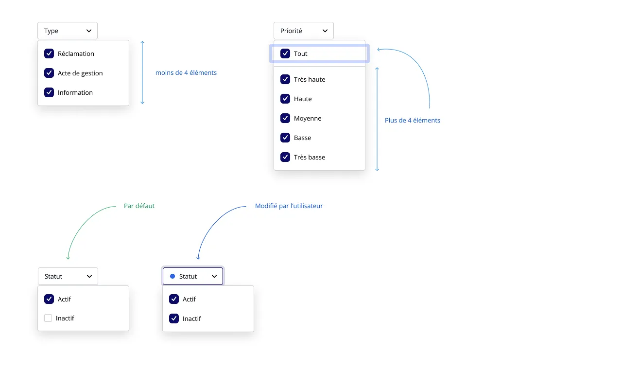
In work where design happens as development progresses, POs and developers are absorbed by production. My role at this point in the project is, among other things, to give them access to the right information. By creating pathways in the available information, my goal is to help them develop reflexes. These reflexes will translate into consistency in labels in tickets for developers, in what should be displayed by default, what can be hidden. This knowledge sharing is essential: design is then no longer solely the designer’s concern, but the entire team’s. It’s only by appropriating this information that principles can spread throughout the product.
Documenting and communicating: the largest part of the work
Changes to the information architecture are shared, improved, then disseminated. This is an essential phase of the work: the new structure is disseminated within the team, then, concentrically, to the rest of the company. Sharing this work is essential. In the long term, it’s partly on this that the company will rely to develop the next building blocks of the product.
To do this, we need to establish a collaborative atmosphere, and that’s the hardest part. It’s as much about tools as practices. Everyone must share the information they have and make it permanently available to everyone (and email is not a good tool for this) At my level, I encourage using everything that allows everyone to have the same level of project knowledge: document whenever possible, and in a lasting way. Miro, Notion, Confluence, a wiki, it doesn’t matter, as long as information is centralized and its updates are collaborative.
To allow information to flow, format also matters. Not everyone has the same relationship with information: some retain by reading, others by watching a video. Some have visual memory, others auditory memory. So, whenever possible, I try to duplicate information in several different formats: images, text, sound, animated images.
An objective achieved
To summarize, my action is distributed around these four tasks:
- Understand the business and context
- Generate ideas
- Polish and adjust them
- Communicate these ideas
Today, the vast majority of clients who have been able to get their hands on the new interface are won over. The goal of simplification, or rather streamlining of managers’ tasks, is achieved. The result: increased efficiency in task completion and less effort required for manager training.